It enables quick visualization of patterns, trends, and outliers, crucial for exploratory data analysis (EDA). Understanding data visually helps in selecting appropriate features for machine learning models.
It offers full control over plots, making it ideal for publication-quality and customized visualizations.
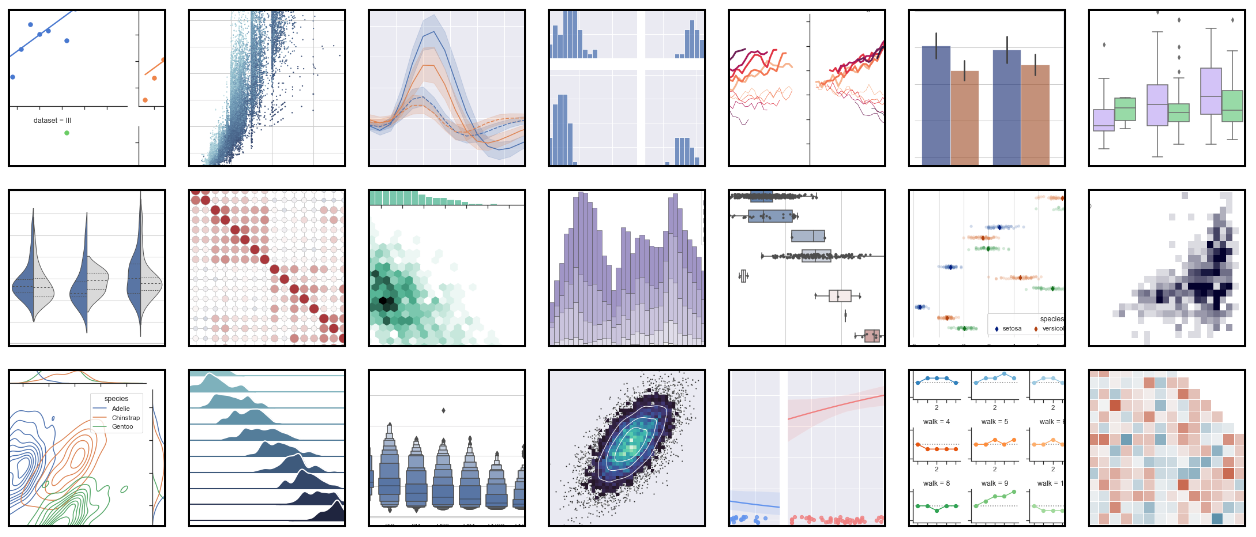
Matplotlib supports a wide range of plots: line, bar, scatter, histogram, pie, 3D, heatmaps, etc.
It integrates seamlessly with NumPy and Pandas, making it easy to visualize structured data.
Visualizations improve communication of results to non-technical stakeholders and decision makers.
Diagnostic plots like residuals, correlation matrices, and learning curves are vital in AI model tuning.
It supports interactive plotting in Jupyter notebooks, ideal for teaching, demos, and prototyping.
Mastery of Matplotlib is a stepping stone to more advanced tools like Seaborn, Plotly, and Dash.
Why visualize data?
Data visualization in Data Science & AI
Overview of Python plotting libraries
Installing and importing Matplotlib
pyplot
vs object-oriented API
Creating a simple line plot
Plotting multiple lines
Adding title, labels (xlabel
, ylabel
, title
)
Legends, grid, and axis limits
Saving plots (savefig()
)
Line plots
Bar charts
Vertical and horizontal bars
Grouped and stacked bar charts
Histograms
Bins, frequency distribution
Normalization
Scatter plots
Customizing markers, colors
Annotating points
Pie charts
Labels, explode, percentages
Line styles, markers, and colors
Figure size and DPI
Fonts and label customization
Using styles (plt.style.use
)
Themes and rcParams
subplot()
vs subplots()
GridSpec for advanced layout control
Adjusting spacing: tight_layout()
and subplots_adjust()
Sharing axes across plots
Creating figure and axes with plt.subplots()
Accessing and modifying Axes
methods
Adding multiple plots on same Axes
Titles, labels, legends using OOP API
Adding text with text()
, annotate()
Arrows and highlights
Customizing annotation styles
Highlighting important data points
Plotting Pandas Series and DataFrames
Using NumPy arrays for visualizations
Comparing with pure matplotlib.pyplot
Time series plotting with Pandas
Box plots
Violin plots (via extension)
Heatmaps using imshow()
or pcolormesh()
Error bars (errorbar()
)
3D plots using mpl_toolkits.mplot3d
Line, scatter, surface plots
%matplotlib inline
, %matplotlib notebook
Enabling zoom, pan
Integrating with ipywidgets
Simple dashboard with interactive controls
Plot aesthetics for reports
Exporting high-resolution images (SVG, PDF, PNG)
Consistent color palettes
Branding and watermarking plots
EDA of Titanic Dataset
Visualizing COVID-19 trends
Visualizing ML results (confusion matrix, ROC curve)
Comparing models visually
Creating a visual story from a dataset